How I Built a Python Script that Could Data-Mine 40,000 Work Orders for Popular Pantone Colors.

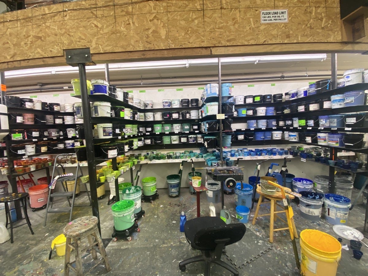
A staple of every screen printing shop is the ink room. Some are large, some small, yet all contain stacks of shelves with multitudes of buckets, bowls, cups, each brimming with a different plastisol ink color, green, red, navy, gold, columbia blue, neon jade, ruby pink, or any other pigment perceptible to the human eye. The ink room is a glorious rainbow of every color you could ever imagine, and even some colors you couldn’t imagine, like a radiant fluorescent seafoam turquoise, or a neon pink that strikes your eyes like a viper. Sometimes I’m so overwhelmed by the colors that boldly defy description I can’t sleep at night, my curious mind awash with the mystery and wonder of so many enchanting shades and hues. It’s enough to drive a man to madness.
Anyways, there are about 2000ish possible colors (that’s how many are available in the Pantone book), but most customers are cool with using normal plain Jane colors, after all the 50 shirts their small construction business ordered are just gonna be worn by construction workers.
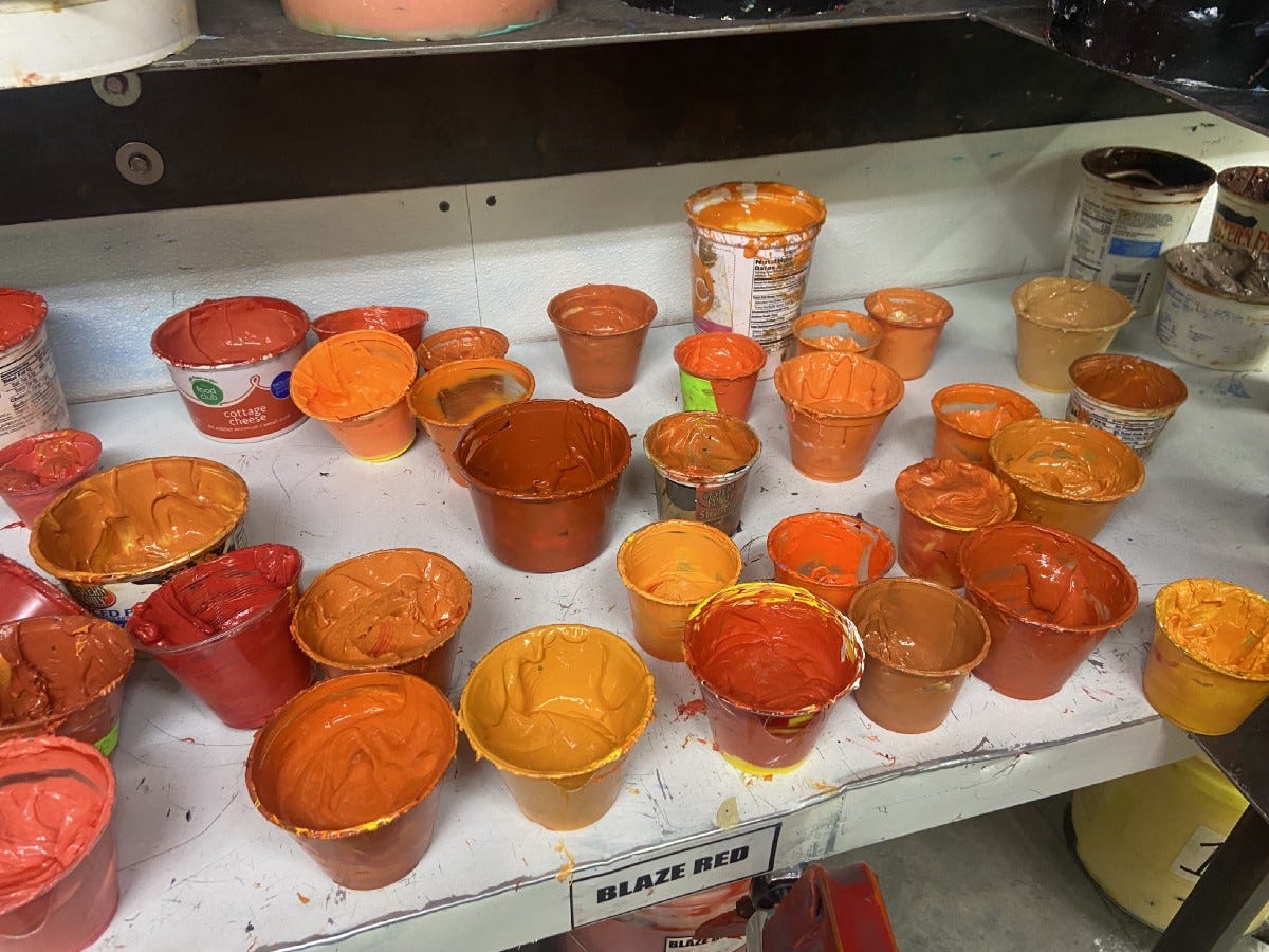
That said, there is a large minority of customers that might have a complex design for a shirt that needs maybe 4 different shades of pinkish-mauve, or maybe they need 7 muted rainbow colors, either way they’re going to need a lot of unique custom inks mixed. This is problematic for screen printing for several reasons.
It’s difficult and time consuming to mix a new and unique color of ink.
There’s always some ink left over after a job. If a customer wanted a weird puke-mustard-brown, once the job is over that ugly color is going to stay on a shelf somewhere and will probably never be used again.
Since the pandemic, ink costs have doubled and tripled in price, so it’s expensive to continually fill up shelves and shelves with unused custom inks.

So the problem is we lose time mixing custom inks, while at the same time those custom inks take up more and more of our limited shelf space. To solve this problem I started a project at my screen printing shop where I would build a Python script that could data mine the last 10 years of work orders to find which Pantone colors customers most often requested, and then use that data to create a chart of house colors made of the most popular Pantone colors. Each color on the house chart would be pre-mixed and ready to go once requested, and if a customer wanted a color that wasn’t on the chart, we could charge them a fee for a custom ink mixing service. This way customers would be financially more inclined to use house colors which saves the shop time from mixing.
The idea of a house chart of colors isn’t new, many screen printing shops have them, but the colors are usually chosen by an employee and may or may not be popular with customers. By crowd-sourcing all our past customers color-decisions, my method would mean the chart would contain the most statistically popular pantone colors.
Building the Python Script
The first problem was all 40,000 of our past work orders were simple pdfs that only displayed a PDF picture of the pantone number. So instead of sitting down and reading all 40,000 work orders, laboriously recording each pantone number in a giant excel sheet, I used Google’s Tesseract engine to read each PDF and turn it into a string.
From there it was as simple as regexing for pantone numbers and adding them to a dictionary with the pantone as the key, and the number of customers that ordered it as the value.


If you’ve ever flipped through a pantone chart, one think you’ll notice is that many of the colors in it are baaaasically the same.

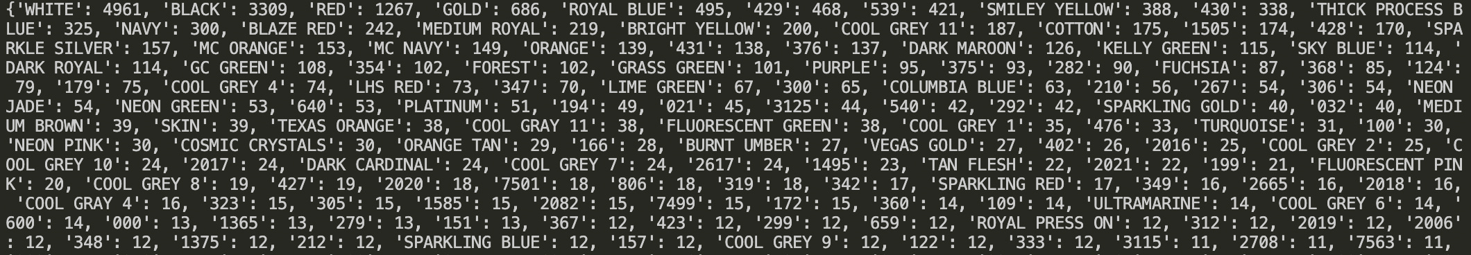
For example, hypothetically the data might show that the pantone number 368 Green was chosen by 21 customers (hmmm well done 368 Green, very nice!). But let’s say 602 Yellow was chosen 14 times, and 393 Yellow (which is extraordinarily close to 602 Yellow) was chosen 12 times. The original data says that 368 Green is more popular with 21 customers than 602 which has 14. But if you could add 393’s hits to 602’s hits, 602 would have 26 hits, 5 more than 368 Green.
In order to find all of the similar colors in the pantone book, I used an old fancy shmancy trick called Euclidean Distance.

The equation for Euclidean distance will find the straight line distance between any two points on a graph with any number of dimensions. This meant I had to convert all of the pantone data points into L*A*B* color which has 3 dimensions; Lightness, Green←→Red, and Blue←→Yellow.

This Python script takes the most popular color in the data which is Red 185 (it’s actually the 3rd most popular, because the 1st and 2nd are black and white) and then finds the Euclidian distance between it and every other pantone number in the data. If pantone X is less than 5 (graph units?) from Red 185, the script deletes pantone X and add its hits to Red 185. Then the script does the same thing with the 2nd most popular pantone, then the 3rd, and so on…
Once all the similar pantones were consolidated together, I took the top 134 most popular pantones and created a house chart.

Now each of these colors will be pre-mixed and ready to go the moment a customer requests it. Customers will feel like they have more color choices, and the shop saves time, money, and shelf-space.